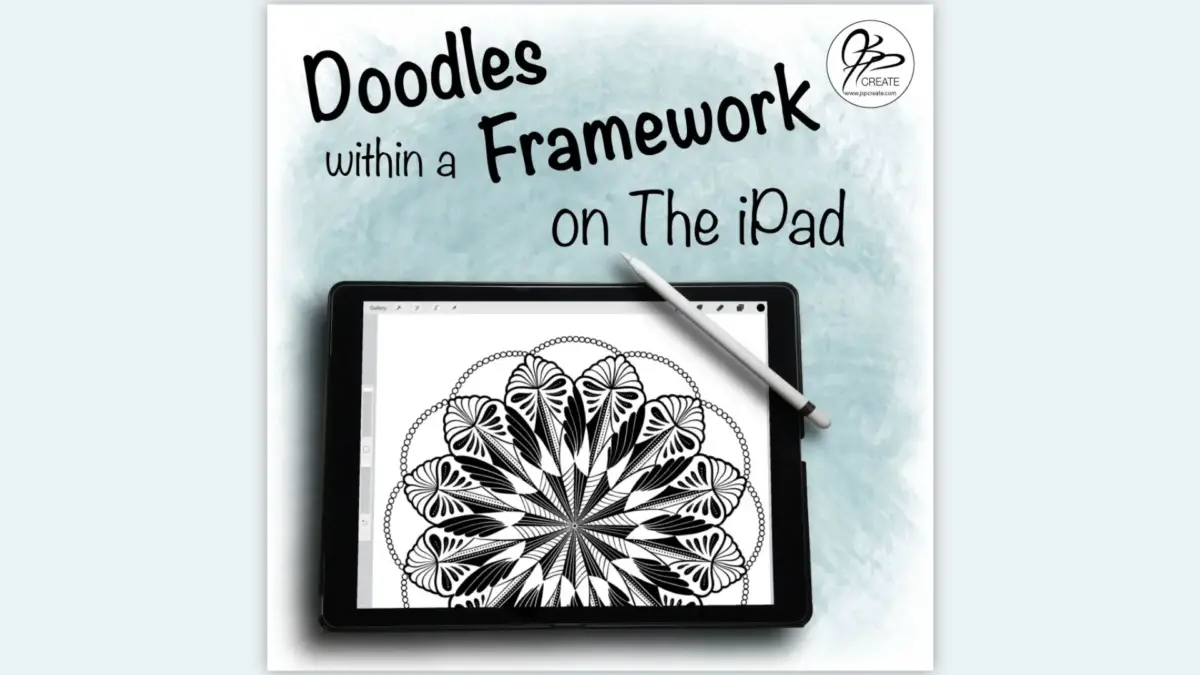
Last week, I shared with you my technique for using a circular framework grid, to draw a symmetrical design using pencil and paper. In this second part of the series, I will be sharing how I do this technique on the iPad Pro with an apple pencil. The popularity of the iPad is growing and as much as I love relaxing with paper and pencil, the iPad Pro is becoming a really great alternative, and I have become quite attached to mine. Easy to take with you, endless supply of paper / canvas and an amazing variety of pens / brushes, all in one compact, portable device.
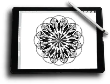
Your iPad Canvas
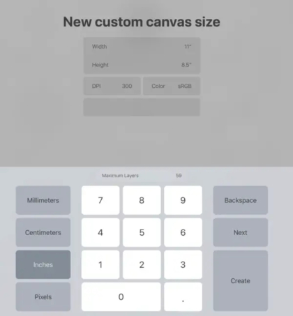
Let’s begin by creating a new canvas. If you think you may want to print out your iPad art, it’s a good idea to make the canvas size the same size as your printer paper. Choose inches as your units and create a canvas that is 8 1/2″ x 11″. Choose a DPI of 300 which gives a nice crisp detail without making the document file size too large and still allows lots of layers to play with.
Your iPad Framework
In the previous post I explained my process for drawing my frameworks using a pencil and a compass. You can draw it by hand and then scan it into your camera roll on your iPad, or you can create one digitally. This can be done using a vector based program such as Illustrator or you can do it right on the iPad using an app such as Graphic. This is a technique I will cover in a future post. But simply said, I use shapes and rotate tools to create a simple symmetrical framework.
No matter your method, you will want your framework image to be saved onto your camera roll on your iPad. You will then insert it as a layer, into your canvas in Procreate, using the Image / Insert a Photo options under the wrench tool.
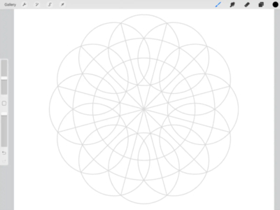
I am using the same framework in this post as I did for the pencil and paper version. It is in a png format, with a transparent background and can be placed anywhere in your stack of layers without interfering with any other layer. A jpg image will also work fine, it will just need to be placed at the bottom of the stack of your layers, so as not to block out any of your drawing.
Use Simple Shapes from your Framework
Once you have imported your image into your canvas, change the opacity of the framework layer to approximately 20%. You will still be able to see the framework, but it will not distract you from your main drawing. It is just a guide. Now create a new layer and start your drawing.
 |
 |
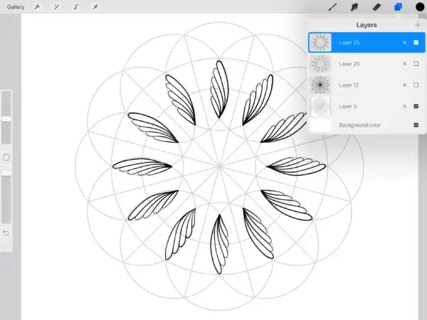 |
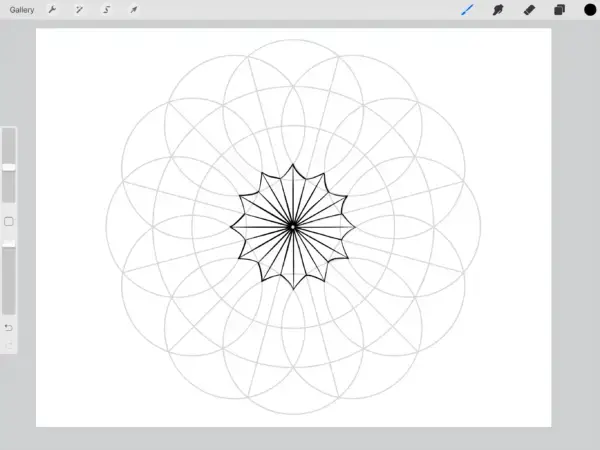
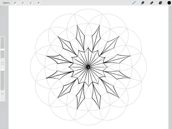
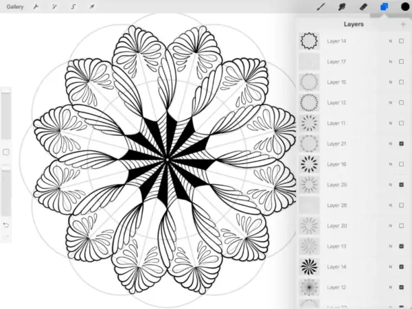
I usually work from the centre and make my way out to the edges. Start with simple shapes, putting each new set of shapes onto their own layer. As you can see on the far right above, there is a layer for each set.
One of the easiest ways to start creating shapes is to find ones that are already in your framework. Use the framework lines to trace out some initial shapes. Choose whatever brush you like to work with. I like the Studio Pen and the Technical Pen as well as a few I’ve made of my own.
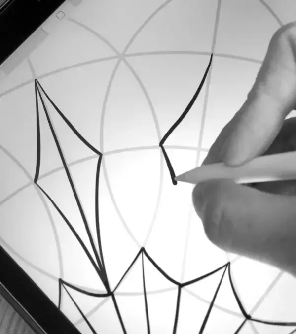
Work in Layers
By working each shape idea onto a new layer, it allows you try out new ideas in your design. You can turn each layer on and off to see how the shapes work together. Try creating a few layers for the same space, with different shape ideas, and choose the one you like best.
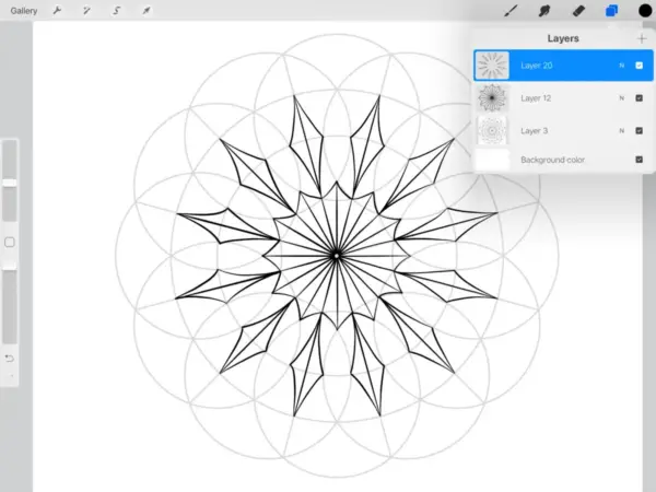
You can also turn off all the layers you are not currently working with. Sometimes it is nice to have this clean grid to work on, with no distractions. It also means you won’t mistakenly draw on the wrong layer. You also have the option to lock any layers you want to keep visible, but don’t want to draw on by mistake.
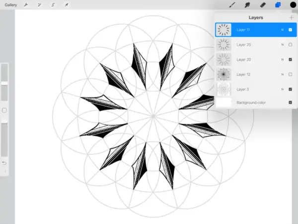
Every Idea Has A Layer
Once your happy with your shapes, then start adding in details, on their own layers as well.
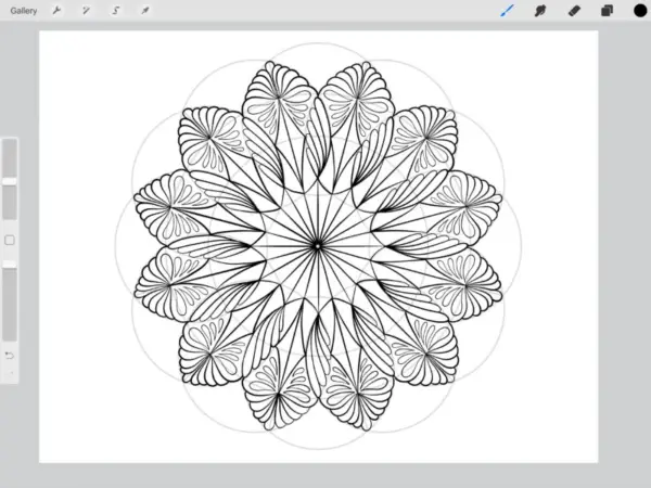
You may want to merge two layers if you need to work with detail that involves the design elements on both, such as creating a filled section. Duplicate the individual layers to keep as backups before you merge them.
Zoom in For Detail
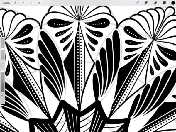
One of the biggest advantages to working on the iPad Pro is the ability to zoom in and make small sections larger and easier to add detail into. By choosing a 300dpi or larger this ensures the detail is crisp and not pixelated as you add it in.
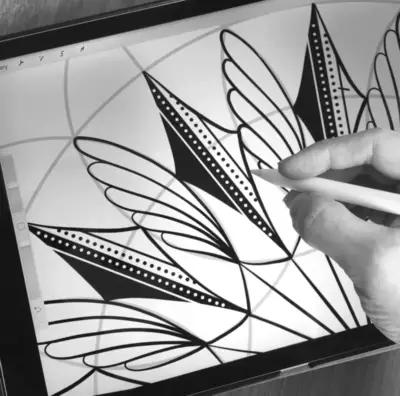
The eraser is a great way to add more detail by removing any of the colour from your fills with a texture brush. the white dots below are erased out from the black fill.
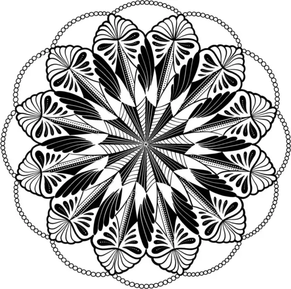
And There You Have A Beautiful Symmetrical Design
When you are done, you can just leave all the layers as they are, and save the image to your camera roll. Or you can export your design as a PDF to print out.
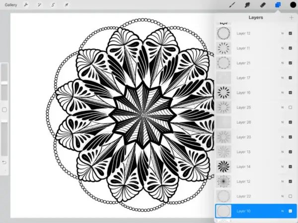
By turning on and off different layers you will have many different versions of your design. Save your design in the gallery and come back to it to play around for more design ideas.
If you would like to work through this process with me in a step by step manner, you can check out my full class Geometric Design on the iPad, Mandalas in Procreate. I walk you through my method for creating symmetrical frameworks and mandala designs. In this class I also show you my technique to draw your shapes once and then rotate them around your canvas.
Want To Learn More?
Check Out More of My Drawing Classes
Thanks for joining me and getting creative.
“I found I could say things with color and shapes that I couldn’t say any other way – things I had no words for.” – Georgia O’Keeffe

